Welcome to the "Oak Cave."
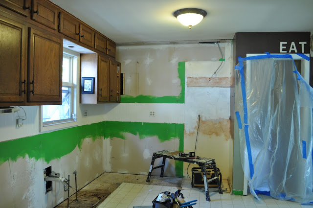
This room has hardly any natural light and the cabinets were light suckers. The minute we do the roof a Solatube skylight is going in.
We had that plasticky laminate floor, and if you notice, the people who put the cabinets in ( two- owners ago) didn't: 1. line up any of the top cabinets and 2. shoved the stove right up against the wall so there was no right-side work space.
Our kitchen is only about 7 x 11 with the cabinets. We had not planned on doing a remodel until the kids were much bigger. A burst pipe over the summer and mold changed all that.
I kept smelling a smell, like a faint, stinky dampness, and having some weird tummy upsets after the burst pipe and the floor felt funny under my feet. We had the inside bottom of the sink cabinet ripped out to see what was underneath and eh amount of water damage I found was incredible. My heart sank when I realized the amount of water damage there was. Not to mention that it was a sink drain pipe so it was basically food waste water.
I interviewed 6 contractors till I found one I could work with and went with our budget. He wasn't lowest bid, and he wasn't the highest, but he was the right one for us and he did beautiful work (Klaske construction, Dekalb, IL).
We had to replace the bottom cabinets as they were water damaged but couldn't afford to replace the uppers.
When the floor came out we saw why there was such a small. This was October and the flooring was still wet under all of the layers of old vinyl flooring. The wood was composting. Two layers of wet stinky mushroomy ick. I cried. A lot.
Then when all of the bad flooring was out; I felt relief like I hadn't in months.
Can you see how bad the flooring is under where the sink was? All of that rotten floor was hidden.
We could not afford to replace the top cabinets, so we opted to paint them and have the new cabinets come unfinished so we could match them.
I scrubbed every last board with vinegar, soap and Borax.
Our contractor reconfigured the upper cabinets around for us so we could gain that right sided work space, and the kids didn't risk the chance of burning themselves coming right up the stairs.
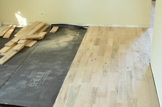
Once plywood went in, I kind of missed the wide planked subfloor. :) I wanted to go as low VOC as possible so I opted for plywood as sub-floor over OSB. Same as the cabinets. We paid a bit more for plywood backs instead of pressboard.
We also knew we wanted to go with real wood this time. We opted for what's known as "grade 2" rustic red oak,or the cheap stuff, but we love it. it has knot holes and dings and it's full of character.
After the flooring went in, the cabinets went over the top. Some how I missed this step. We added trim to the bottom of the cabinets before we painted. Sometimes it was such a rush to get things done between the contractors steps.
Stone was out of our budget and laminate off-gasses VOC's for up to 7 years, plus it's not a recyclable or biodegradable material so we went with wood countertops. I also found a sink made with 93 % recycled materials for under $200. Being eco -friendly is REALLY HARD on a budget, so it's about the best choices for you.
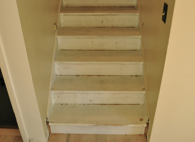
We were lucky, these stair treads were already under the old carpet. So we had them refinished to match the floor.
The color is a mixture of dark brown and mahogany. I knew I wanted dark, rustic floors. The refinishing products were all low-VOC as well . Though, I still thought they smelled.
One of the really big decisions we made in our kitchen was to actually remove some cabinets. I wanted character and storage and I didn't just want more painted cabinets.
This hutch was a $200 Craigslist find. I did want something old; but the $900 one I loved from the flea market broke the bank. By putting in the hutch, I actually gained more organized storage, and it gave us a few more inches as standard cabinets are 24 inches and the hutch is only 19. Plus, the average cabinet is roughly $250 per cabinet. That would've been almost $1000 for the same storage!
I picked the color Bennington Grey from Benjamin Moore paints and had it mixed in their Aura line. It's a great taupe-y grey color, that has a bit of a warmish-green under-tone. The base color is BM Linen white the same as the cabinets, only flat instead if satin.

Originally, I tried green on the cabinets, but I just wasn't feeling it. I really wanted to bring some color in.
I decided to do it with the hutch.
I also decided to NOT put knobs on the upper cabinets so there is not as much attention on the fact the upper cabinets are so wonky.
To take the grain down on the cabinets, after sanding, I puttied over the deeper ones with wood putty and sanded again till smooth.
The last step was adding the now painted and distressed hutch,saying bye to the boob light and hanging my grandmother's rewired chandelier. We added a embellished element to cover up the gap with the old light and new light.
The hutch has felt sliders on the bottom so I can scoot it with out worrying about scratching the floor.
I added some crystal knobs in the little space between the hutch and pantry for my aprons.
The Westham sign is a family thing. We still need to do crown molding, but that will be next summer.
We removed the wood piece over the sink and replaced it with corbels we found on-line. It was a really inexpensive up-grade. And I needed a spot for my dish towel, So why not a towel bar on the front of the cabinet?
I also didn't want a big hunk of brown wood for a back splash, so we used trim.
The countertops need to be oiled with a sealer every few months. Mostly around the sink 's wet all of the time. The other part I do twice a year. You put it on and it dries overnight. You can tell because the water beads right up. The best part is when your coffee maker overheats and smokes about a week after they are installed and leaves a burn mark, you can just sand it right out and reseal.
And so even though there are still little things we need to do, it's mostly finished. I really want marble top for my island for bread and pasta making, and some day some new appliances, but I love the brightness the white brings.


